The GraphConnect 2018 – the gathering of graph enthusiasts in Times Square, New York City – featured a special gem for developers. The friendly guys from Stack Overflow opened their offices and invited developers and hackers to a “Hackathon” all around Neo4j.

The task of the Hackathon was to play “buzzword bingo” from a set of awesome, graph-related buzzwords and technologies on a bingo card, where participants had to come up with a technology “BINGO.” There were prizes for the winning teams in the categories of Best Use of Cypher, Best Visualization, Best Fully Functional Application and a prize for Most Buzzword Technologies Used.
yWorks is a proud member of the Neo4j graph community. We build the graph visualization library “yFiles” – a great tool for developers to create interactive visualizations on top of their Neo4j data. Of course, we had to participate in the event.

The event attracted many developers from diverse industries, and a larger part of the audience had only briefly worked with Neo4j before, so realizing a project with a new team (and just a little more than four hours time) was quite a challenge.
For us at yWorks, it was very interesting what kind of results we could expect to see from developers that had little to no knowledge of Neo4j and visualization, let alone our diagramming library yFiles.
To get something up and running in such a short amount of time, it was an obvious choice for multiple teams to reuse an existing solution for their visualization needs, instead of doing all the work from scratch.
Three developers from yWorks helped the teams with their visualization task. However, since we did not want to give some teams an unfair advantage in the category for best data visualization, we restricted ourselves to consultancy work and did not write any code.
Before the teams actually started with the hackathon, they could participate in a one-hour crash course on working with Neo4j and Cypher, or how to build their own yFiles-powered visualization app as a white-label solution on top f the Neo4j graph database.

There were more than half a dozen projects pitched and many of the teams decided to put visualization on their bingo cards – obviously because visualization and graph databases go very well together. You can achieve great results and you will be able to understand your data much quicker with visualization. And, of course, sophisticated visualization lends itself perfectly for communicating the results of your projects and proof-of-concepts to your non-developer colleagues.
Because of the limited time the teams had, those who chose to put visualization on their bingo card were able to simply use yFiles. They didn’t have to spend too much time on getting the application to run, determining where and how to place the elements on the screen, do the styling and configure the interactions. They were happy to be able to reuse sensible default settings and could base their work on existing code samples that come with the library. Also, if time permits, any of these aspects can be improved later on without having to rewrite the rest of the application.
I offered my help to the “Spatial Graph App” team led by Craig Taverner. They had a very interesting project where they wanted to create a custom app that integrates with the Neo4j Desktop. That app should use the new geo-spatial features that have become available with the latest Neo4j release.
They had a huge dataset in their Neo4j database that consisted of the geographic data of the routes through Manhattan. It consisted of several ten thousand routing points and connections. They knew there were some problems with the dataset, but without an effective visualization it was impossible to debug the problem efficiently. So their choice was obvious: Their buzzword bingo card was about Neo4j for the storage of the data, the spatial functions in Neo4j to query the datasets, yFiles for the visualization and ReactJS for creating the Neo4j Desktop application using JavaScript.
Importing the data into Neo4j turned out to be super easy with the built-in geo-spatial support:
> LOAD CSV WITH HEADERS FROM 'file:///routingGraph.csv' AS line
> MERGE (a:Routable {location:point({latitude:toFloat(line['p_lat']), longitude:toFloat(line['p_lon'])})})
> MERGE (b:Routable {location:point({latitude:toFloat(line['x_lat']), longitude:toFloat(line['x_lon'])})})
> CREATE (a)-[:ROUTE]->(b);
Surprisingly, the team’s greatest problem was neither the seemingly complicated technologies of Neo4j, Cypher or the visualization. It was a tool that hundreds of thousands of developers use all the time that slowed them down the most. The ReactJS tool-chain and some incompatibilities between minor React versions turned out to be the greatest pitfalls!
So time passed and almost no time at all was spent on the visualization. I really wanted to help them with the coding and integration of the visualization, but I had promised not to write any code. Twenty minutes to go until the presentation and we had not even started to connect the data with the visualization component!
Ten minutes left to go and the team cheered when we finally saw the data on the screen for the first time. This was after almost three hours fighting with the React build-system and other issues that were totally unrelated to the actual task. Time was running out and we had to quit and prepare the presentation for the judges.
Laughs were definitely on our side when we presented our the data set to the jury. We had not managed to configure the coordinates for the visualization in time, so even though we were able to present the routing graph of the streets of Manhattan to the jury – queried from a Neo4j database with a custom geo-spatial query – all of the ten thousand elements and connections where still rendered on top of each other in the same location on the screen.
Although technically a success, obviously our chances to win the prize for best visualization were close to zero.
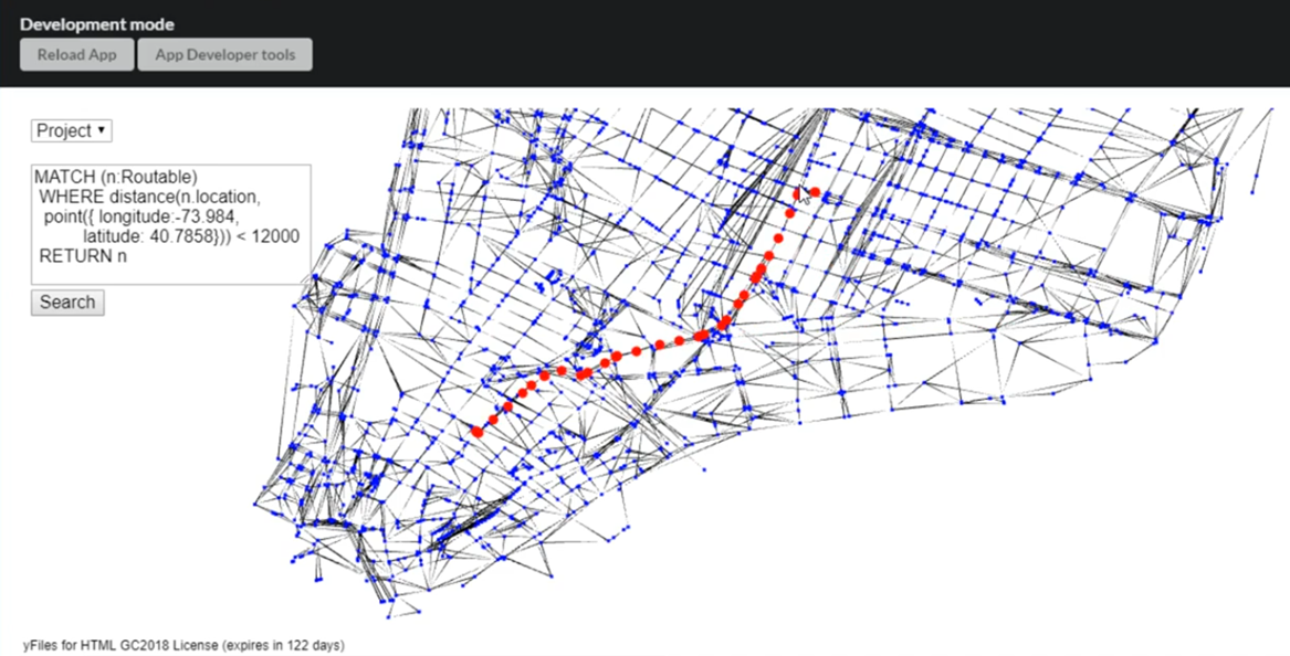
After we left the stage, I decided I could now intervene and helped the team add the two (!) missing lines of code to the project to actually get a nice visualization of the streets of Manhattan.
> graphBuilder.locationXBinding =
   node => node.properties["location"].x * 100000;
> graphBuilder.locationYBinding =
   node => node.properties["location"].y * -100000;
We still did not win the prize for the best visualization, but the jury decided that the “Spatial Graph Apps” team had won a special prize for their outstanding perseverance and agility.

On my way back home from the conference, I decided I wanted to polish the app a little more. Graph visualization is fun when you have the data and it didn’t take long to incorporate a few more nifty features.
The spatial app feature in Neo4j really makes working with geo-spatial data a breeze: I was able to easily modify the Cypher query to show exactly the data that I was interested in. Also calculating shortest-paths directly on the database is possible! I changed the visualization to use WebGL for rendering of the routing graph and used SVG to render high-quality shortest-path visualizations on top of it.
With a few simple mouse-clicks in the app it was now possible to interactively explore the data set and calculate a routing through Manhattan.
So who won the price for Best Graph Visualization?
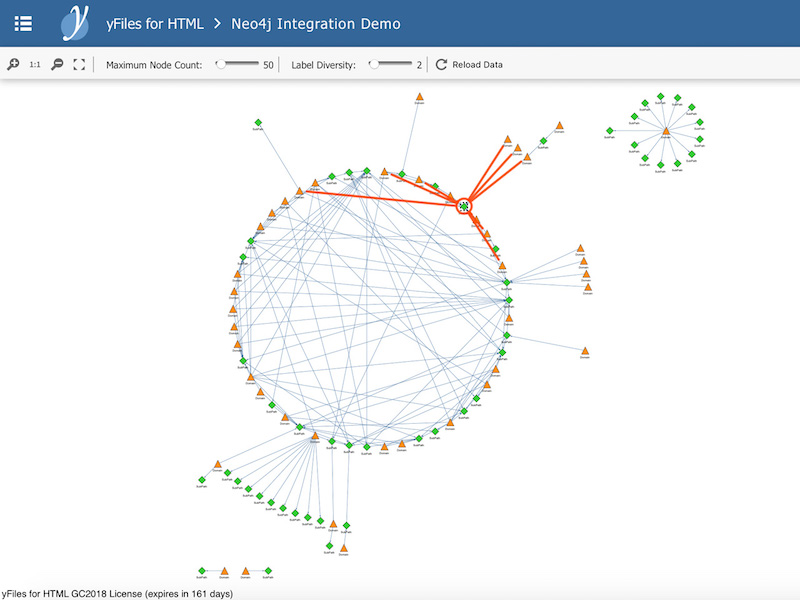
It was the team “BrowserBuddy” who also decided to use yFiles for their visualization. The team around Benjamin Squire was able to reuse a generic yFiles/Neo4j demo and created a visualization around website domains and http sub-paths. The diagram represented multiple domains, which were connected to various sub paths.
The highlighted subgraph shows a single domain and a few of its first-level subpaths, which are also shared among other domains. They used a customized layout algorithm to automatically arrange the elements in the diagram and easily convinced the jury with their presentation:
Congratulations to Ben and his team for winning the contest!
We had a terrific time at the Stack Overflow offices that day and once again we were shown what great visualization can do with the data in your Neo4j database. If you would like to play with the tools yourself, feel free to evaluate yFiles at no cost. You can create awesome visualizations quickly and integrate them as white-label components into your existing dashboards and applications.
What are you waiting for? Happy diagramming!


