yWorks exists for almost 20 years now and has a long history of developing diagramming software. We started as a spin-off of the Eberhard-Karls-University in Tuebingen and grew over the last 20 years to a leading company in the diagramming world. After all these years of evolving our products, our corporate design had to evolve, too!
The company used an iteration of the classic logo with a "y" in front of the blue circle for its entirety of existence - until 2019. We started with a blue ball with white lines and green shading, then transitioned away from the shading and lastly evolved it into a plain blue ball.
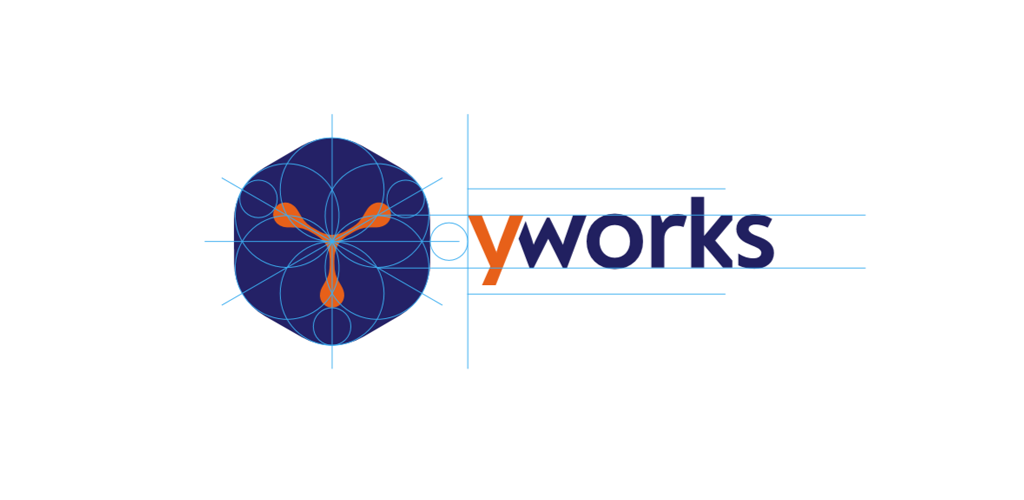
Since yWorks started back in 2000, we focused solely on evolving our products. Now, we want to evolve the company as a whole. As a first step, we thought about our Corporate Identity and our core values and motivation: We want to enable everybody to use the power of beautiful graphs and diagrams. This message has to be incorporated in the new logo for the company as well as the product logos. We worked together with our marketing agency to create ideas and prototypes of how our new logos could look like. We went through a couple of iterations of logos, then, after we settled on one design, we had to make it pass the "yWorks challenge": Can we recreate it with our professional graph visualizing tool, yFiles? Yes we could! Our CTO, Sebastian, scripted an application with which our logos could be sketched out quickly and precisely.
 Our logo generated with the tool made with yFiles
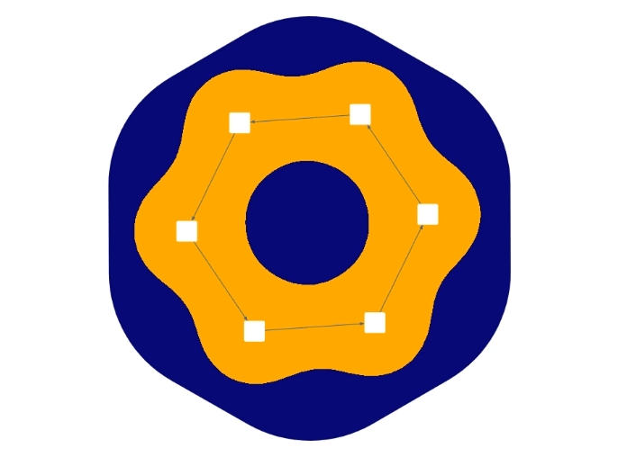
The tool allowed us to manipulate the graph interactively, to find different styles and alterations. The “y”-graph was quickly made, but the size, shape, and thicknesses of the nodes and edges had to be adjusted until we found the perfect balance. The other product logos were made with the same tool by adjusting the number of nodes, changing their connectivity and placement,and finding different combinations to represent the products as best as possible.

We are very happy to have found a set of wonderful logos and colors for our corporate design, which represent our core value: enabling everybody to use powerful and beautiful graphs and diagrams. And, as a bonus, our logos look great in different color combinations!